Packaging is crucial to how a brand is perceived by the purchasing public. Therefore, it’s quite remarkable that even the most well-known brands sometimes end up making calamitous packaging mistakes.
Faux pas range from overlooking religious sensibilities to being sexist, downright rude, or just taking things a bit too far. Here are some examples of packaging disasters for your enjoyment and enlightenment.
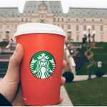
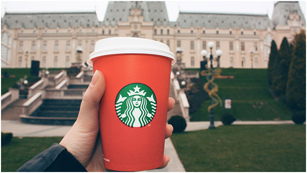
Starbucks – Christmas Cups: Non-Christian religious groups and some media threw snowballs at Starbucks for allegedly showing favoritism to the Christmas holiday on its disposable coffee cups. The 2015 decision to subsequently remove all holiday décor and simply use a red cup during the holiday season was far more viciously derided. A multi-year debate over Starbuck’s “War on Christmas” ensured for the next two years until Starbucks restored the holiday-centric design in 2017.
Dr. Pepper – Sexist Soda: A version of Diet Dr. Pepper contained only ten calories. The drink was aimed at getting men to drink more diet sodas, so the product was labeled as being “not for women.” Result – a lot of angry ladies.
Thinx – Oh My Darling: Thinx, a brand of underwear for a woman having a period, featured a peeled clementine which bore an unmistakable resemblance to female genitalia. The comparison of a clementine to a female body part was deemed to be too “fruity.”
Budweiser – Don’t Say No: Bud Light was touted on their pack has the “perfect beer for removing ‘no’ from your vocabulary.” This didn’t go over well with groups concerned with drug abuse, sexual assaults, and human rights.
Sprite – Too Beastly: Sprite branded its bottles with the hashtag “#BrutallyRefreshing.” The idea was to tweet a refreshing, honest statement, rather than some kind of sugar-coated banter. This campaign produced some “brutally” rude captions and tags in response.
Kraft – Too Crafty: Kraft decided to replace its clean, three-colored, iconic logo with a more complicated design having nine opposing colors. Result – customer confusion.
Tropicana – Not Enough Juice: Tropicana also did away with its instantly recognized logo and “achieved” a more generic look. Result – plummeting sales. According to an article on Ad Age, following the packaging change, “unit sales dropped 20%, while dollar sales decreased 19%, or roughly $33 million, to $137 million between Jan. 1 and Feb. 22.”
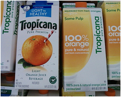
Ultimately, the lesson learned from this misstep by Tropicana was that brands should never change too many brand elements at once to avoid customer confusion. In the case of Tropicana, they tried changing their logo, typography, slogan, image, and lid all at one time, causing a disastrous result.
Nutri Choice – Not Enough Choice: Too much of a lookalike. Its packaging does not stand out from its competitors.
Really Think About Your Packaging
As well as slogans, companies must consider how products are packed for shipment. When designing packaging, learn from the mistakes of the top brands.
If packaging attracts a lot of consumer criticism or results in falling sales, then it’s time for a redesign. Smart packaging and good product perception is key to maintaining a good relationship between sales and marketing too.


